
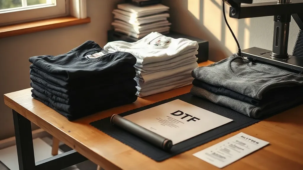
Most print shops learn the hard way that a great DTF transfer can still fail on the wrong blank. The ink is fine, the press is calibrated, and yet the finished shirt looks muddy or feels stiff. Nine times out of ten the culprit is the garment itself. That is why so many shops have started standardizing on shaka wear as their go-to blank line, and why the pairing between garment and transfer deserves more attention than it usually gets.
This guide is about that pairing. Not press settings, not gangsheet layouts, but the quieter decision that happens before either of those: which blank goes with which print, and why some combinations look premium while others look like a craft project.
Why the Blank Decides How a DTF Print Looks
A DTF transfer is a layer of pigment ink bonded to a garment by a thin adhesive film. That film has to melt into the fabric surface, not sit on top of it. When the fabric is too loose, too slick, or too heavily finished, the adhesive grabs unevenly and you get the familiar symptoms: cracking at the edges, a plastic hand feel, or a print that looks duller than the artwork.
Shaka Wear blanks tend to work well here because the cotton is dense and consistent. A heavyweight ring-spun tee gives the adhesive something stable to bond to, and the surface texture is fine enough that fine detail in a transfer survives the press. That consistency is the real reason shops keep reordering: not brand loyalty, but predictability across a run of 50 or 500.
Fabric weight and how it changes the hand feel
A 5.5 oz tee and a 7 oz tee will not produce the same print. On lighter fabric, the ink film sits closer to the surface and can feel more prominent, especially with large solid areas of color. On heavier fabric, the print tends to settle in and feel softer against the skin after a wash or two. If your customer base cares about a broken-in feel, lean heavier. If they want a lightweight summer tee, accept that the print will read a bit crisper and slightly stiffer, and plan your artwork accordingly.
Color choice is a print decision, not just a style decision
White ink on a black tee is the classic DTF scenario, and it works because the white base layer has full opacity to work with. The trickier combinations are mid-tones: heather grey, sand, olive, and washed colors. On these, a transfer with a white underbase can look chalky if the base is too thick. Ask your transfer supplier to tune the base for the garment color, or choose designs with darker outlines that hide the transition. This is one of those small decisions that separates a shirt people wear weekly from one that ends up in a drawer.
Matching Shaka Wear Styles to Common Print Jobs
Shaka Wear covers a wide range, and the range is exactly why it pays to think in categories rather than one universal blank. Here is how most shops we talk to split their inventory.
- Heavyweight tees for retail and streetwear drops. Dense cotton, structured shoulder, holds a large back print without sagging. Best for bold graphics and anything sold at a premium price.
- Midweight tees for team and event orders. Comfortable for all-day wear, prints cleanly with moderate detail, and keeps costs sensible on volume jobs.
- Long sleeves and hoodies for layered designs. The heavier surface handles multi-color transfers well, but watch the seams. Prints that cross a shoulder seam need extra press attention.
- Light colors for photo-style transfers. Fine gradients and soft shading read far better on white and natural blanks than on dark ones.
If you are building a DTF Gangsheet Builder file for a mixed order, group these categories on separate sheets. It sounds obvious, but mixing a heavyweight back print with a lightweight sleeve logo on one sheet often leads to uneven pressing because you end up adjusting temperature and pressure mid-run.
The Prep Steps That Save a Whole Run
Before the transfer ever touches the platen, two minutes of prep prevents a stack of reprints.
- Pre-press the garment. Ten to fifteen seconds of light pressure removes moisture and wrinkles. Moisture is the number one cause of adhesion failure, and cotton holds more of it than people expect.
- Check for fabric finishes. Some blanks ship with a softener or anti-pill treatment. If a test print peels, a quick wipe with a lint-free cloth and a second pre-press usually solves it.
- Position with the grain, not against it. Align the transfer with the fabric's weave direction so the print does not pull at an angle when the shirt stretches.
- Peel at the right temperature. Follow your transfer supplier's instructions exactly. Cold peel and hot peel films are not interchangeable, and guessing here is how edges lift.
Seams, pockets, and other trouble spots
A print that crosses a side seam or a chest pocket will always be the weakest point on the shirt. Use a pressing pad to raise the seam area level with the rest of the garment, and consider a slightly longer press on those spots. If a design can be repositioned to avoid the seam entirely, do it. Customers notice when a print starts to lift at the edge after a month.
Building a Repeatable Blank and Transfer System
The shops that scale smoothly tend to do one unglamorous thing well: they standardize. They pick two or three blanks per category, keep a printed reference card with the exact press settings for each, and stop improvising. That reference card is worth more than any single piece of equipment.
When you combine a consistent blank with a consistent transfer workflow, quotes get faster, training gets easier, and mistakes drop. A new hire can pick up the card, match the garment to the settings, and produce a saleable shirt on day one. That is the real return on choosing your blanks deliberately rather than grabbing whatever is closest to the press.
If you are placing a mixed order, build the gangsheet around your garment categories rather than around how the artwork happens to be laid out. A DTF Gangsheet Builder makes it easy to arrange and re-arrange pieces before you commit, so use that flexibility to keep similar fabric weights and colors together. Your future self, standing at the press at 6 p.m. on a Friday, will appreciate it.
Common Questions From Print Shops
Does Shaka Wear work well with DTF transfers on dark colors?
Yes. The dense cotton gives the adhesive a stable surface, and white underbase transfers hold up well on black and navy. The main thing to watch is base thickness. A base that is too heavy on dark fabric can feel rubbery, so ask for a tuned transfer rather than a one-size-fits-all setting.
How do I stop DTF prints from cracking on heavyweight tees?
Cracking usually comes from incomplete adhesive melt or from stretching the shirt while it is still hot. Pre-press the garment, use the temperature and time your transfer supplier specifies, and let the shirt cool flat before you fold or stack it. Folding a warm print is a quiet way to create cracks before the customer ever wears it.
Should I use the same press settings for every Shaka Wear style?
No. Weight, color, and finish all shift the ideal settings slightly. Build a small reference chart per style and update it whenever you change transfer suppliers. Testing one shirt per style is far cheaper than reprinting an entire order.
Can I mix different garment types on one gangsheet order?
You can, but group them thoughtfully. Keep heavyweights with heavyweights and light colors with light colors so the press run stays consistent. Mixing wildly different fabrics on one sheet forces constant adjustments, which is where errors creep in.
What is the biggest mistake shops make when pairing blanks and DTF prints?
Treating the blank as an afterthought. Shops spend hours on artwork and minutes on garment selection, then wonder why the finished product feels off. The blank is half the product. Choose it with the same care as the design and the print quality follows.